06/03/2012


With these print results I have monoprinted over the top in blue ink another one of my life drawings. Both of my drawings have very little detail but are not quite abstract and some of the lines are too bold and defined. To improve my print results I would start by recreating my collograph plate to make it more abstract and give impressions that there are figures using abstract shapes and varying materials instead of have obvious lines to convey the figure. Due to my prints being of low quality and there being mistakes when printing there are multiple ways in which I can improve upon my work These mistakes are mentioned on my evaluation of my Collograph prints results verion two entry. To give my prints more texture and lessen the obvious lines of the figure I have introduced other materials into my prints. I added a simple strip of masking tape along the bottom half which goes along the whole print horizontaly. This was only simple but it gives it a new texture. In another print that I had modified and improved I have applied two strips of parcel tape in diagonal angles. This adds new materials to my print and another texture which show that I have experimented. The masking tape and parcel tape are both very simple and easy to apply yet they improve my design graetly and somewhat makes the figure less obvious and the lines that I thought were too bold less obvious and more suttle.
Collograph prints results version two
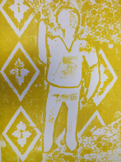
These prints are the results o from the second time in which I printed using my collograph plate. This time I experimented by using multiple colours on a single print. The colours that I used were pale earthy colours; brown, green, yellow and blue. The results were different from my first prints due to the fact that I had modified my plate to improve it in the ways that it was lacking and inadaquate. I firstly removed the buuble wrap since that didn't create a satufactury print design and replaced it in some areas with thin tight netting and in other areas with lines of string. I also carefully using a scalpel and cutting mat remove certain aspects of my print to give it varying patterns through out so that it didn't look like I had just applied simple patterned wallpaper without much thought and left it. I removed areas of the pattern so that it differed from the beginning collograph plate. Although I had sorted out the problem with the bubble wrap I didn't make my figure more abstact which if I were to create again I would change. To make my design more abstract I would create the figues using abstract shapes instead of clear lines. One or two of my prints were messy due to the oil that I had previously used to clean my plate was not fully removed in some areas and when I printed especially on the thinner paper it ran througn the paper and mixed with the colours.


Dawn Cole
Dawn Cole is a prints artist who uses multiple varying techniques to create her work such as; solar plate etching, monoprinting, drypoint and lino etching. I have used lino etching before but not on this project and I can see how it can be applied to my life drawing and any other pieces of my work. I have used monoprinting on my own work during this project and can see the advantages of appling this technique to my work as a way of defing lines. Her work from what I have seen is hard to apply to life drawings since they appear to be more like finey knitted webs rather than abstract shapes and figures.

Sir Terry Frost


Dawn Cole
Dawn Cole is a prints artist who uses multiple varying techniques to create her work such as; solar plate etching, monoprinting, drypoint and lino etching. I have used lino etching before but not on this project and I can see how it can be applied to my life drawing and any other pieces of my work. I have used monoprinting on my own work during this project and can see the advantages of appling this technique to my work as a way of defing lines. Her work from what I have seen is hard to apply to life drawings since they appear to be more like finey knitted webs rather than abstract shapes and figures.
Sir Terry Frost
Sir Terry Frost is an abstract painter who's art consists of multiple abstract shapes in vivid colours arranged in interesting designs. His work would be a good place to look at for my own life drawings and other works. Since my designs have so far not been abstract enough and only being obvious objects and people, and that Terry's work is simply abstract shapes although I will not try to exactly copy his work looking into the use of abstract shapes on their own may well be useful for my later work.

Cy Twombly
Twombly is an artist who works mostly with paint and paints with large paint brushes and creates large scale paintings consisting of what looks like random painted curves similar to graffiti due to the scale and freedom. Due to the simplicity of the technique the lack of detail and the how basic the end result looks his style looks accessible and can possible be replicated without to much skill. When painting he uses very large brushes and paints on pale or blank background on a large scale and paints in a style that is somewhat closer to drawing than painting. His work cannot easily to used as a reference for my own life drawing but the freedom with lines may be a concept that should be explored.

Barbara is a abstract painter who uses a range of vivid and contrasting colours to intemperate landscapes in her own style. This work is very abstract and there are no distinguishing features that let the audience know what it is that is being conveyed in the painting.Her painting technique is more of gesture painting than detailed painting and is similar in that respect to some of my previous life drawings in which I used charcoal. Colour would be the next stage of my own life drawings and her work would be a good style to intemperate because since the images are simple and undetailed the style can be applied to multiple different subjects and can incorporate the colouring scheme and be refereed to as a base for a colour pallete.

Collograph print results
When my print had been used it was much easier to review the print since the outcome had been finished. the A4 prints were painted over and placed into the press and created the prints below. My prints were not fully successful since in my first designs I used bubble wrap which looked alright when review previously made prints but in my one since the bubble wrap wasn't fully secured and was to weak and therefore when it was printed it fell apart and split in certain areas which ruined the work in some spots. If I were to make another one I would avoid bubble wrap. Now that I have removed the bubble wrap from my print I have replaced it with other materials such as netting and spring. My work and overall design is not abstract enough and I will improve upon it later by cutting out aspects and making the form of the person less realistic and let the form drift away to form abstract shapes. I will try cutting up my plate and move the pieces around so that when it is printed again it will not be fully recognisable as a person.


 Quick five minute continuous drawings
 Scaling of model along the side.


 Using multiple pieces if torn newspaper and applying them to a piece of A1 pare using diluted PVA which will work as a background for my work.
 This is a F firstly drawn with charcoal and then further added to it by using brown paper to make it more like the real life item.
This is a close up of a simple charcoal drawing of a shoe


Jet James
Jet James is a prints artist who specialises in collograph printing. His work is based upon the human figure and human figures are depicted within his designs. His plates are also in low relief and use different materials to create his plates. His style and technique is advanced and he is able to create light and shadows and varying tones and different depths in his work which give his art which is an aspect I would like to use and to improve my own plates
Collograph plate
Using the life drawings I have previously completed as a base and starting point I created a collograph plate.This is a printing plate which is made up off different materials; string, wallpaper, card and bubble wrap to give the plate varying textures and patterns. this technique is refereed to as low relief . the plate is only thin so that they can be painted onto and put into printing presses.


Evaluation: The plate that I completed was not very successful since the bubble wrap that I used wasn't fully secured and was to weak and when I went to remove it from the paper it stack to the paper and hindered the design.


Life Drawing day 2
 Quick five minute continuous drawings
  Scaling of model along the side.
Ben Nicholson
Ben Nicholson is a still life artist born in Buckingham, England on 10 April 1894 and died on 6 February 1982 at the age of 87 in London, England. He is a British abstract artist who's work has well designed composition. The work often has multiple layers and consists of straight lines and shapes and thin curves. Since Ben's work has multiple layers it gives them more depth and in a style know as low relief, and with the squared or straighten edged items it gives his designs a cubism style which suits the subject matter that he is illustrating. His style and working practises are some what simple and achievable but he uses his method, techniques and materials to a high standard. The work that Ben has done is similar the work in which I have completed; the way that the layers are cubism and the colouring is similar and has inspired the work which I have done.


This is a initial pencil drawing of an idea, it shows a possible angle to illustrate and the composition.
 Using multiple pieces if torn newspaper and applying them to a piece of A1 pare using diluted PVA which will work as a background for my work.
 This is a F firstly drawn with charcoal and then further added to it by using brown paper to make it more like the real life item.
This is a close up of a simple charcoal drawing of a shoe

This is what turned out from the days work and is a combination of many techniques.
Leonardo da Vinci
Leonardo da Vinci (April 15, 1452- May 2, 1519) was a incredibly famous painter, sculptor, scientist, inventor, polymath, musician, engineer, anatomist and writer during the Italian renaissance. His genius was in many fields and imagination and talent was incredible.
His name itself gives information about him da is from in Italian and Vinci is a Italian town in the region of Tuscany.
In 1466 at the age of fourteen Leonardo was apprenticed to an artist called Andrea di Cione at his workshop, but left 1478. Later during his time in Millian from 1482 until 1499 he was commissioned a few painting including one of the most famous paintings the last supper.
When working he would work less for what the client wanted and asked for and more he worked for himself and sometimes didn't complete the work. His work that he spent most of his own time on were the ones that inspired his own curiosity manly of the human body. Leonardo would go to live dissections of the human body and this is where he would draw his highly detailed and anatomically precise drawings and make notes during. His notes would include information and measurements from the human body and all of the aspects were independently explained and measured and include his theories upon the vitruvis theory of the human body.
For these initial four drawing I used charcoal and smudged for shaded areas and used the side to make a grid like structure for the basic shapes of the objects.


I used a technique for getting the right scale by counting how many heads would it take to equal the same length of the entire person.
I uses a measuring system as a basic scale to give the drawing a more realistic look.


When starting these drawings I would start with basic lines to form the simple shapes and outlines of the body as to get the proportions correct and to scale and later add the detail to the body parts.


